Dot Logo
Our brand is much more than our logo. Our logo is an essential visual cue that promotes awareness and consistency across all communication tools.
The logo is an important visual cue of our brand.
Our logo is the signature of our company.
It is a vital part of identifying our brand.
It is, and should always be, the most consistent component in our communication.

Spot the Dot
Robert Tracy named the company after his wife, partner, and co-founder Dorothy Tracy. “Dot” was Dorothy’s nickname. The company’s official name is Dot Foods, but it is known throughout the industry as Dot.
Keep an eye out on the highways and see if you can #SpotTheDot. We are proud of what our logo and name represents.
Size, space, and color does matter.
We believe that consistency is important. Here are a few simple guidelines we all must follow:
Minimum Size
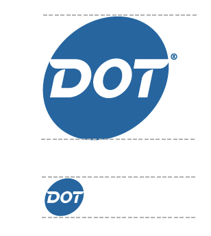
We like our logo to be easy to read. Keep the size legible and always give it breathing room.
With ®
Print = .75” height
Screen = 90 pixels height
Without ®
Print = .25” height
Screen = 33 pixels height


Clear Space
How much space does the logo need, exactly? The width of the letter “T” in the logo on every side is sufficient.
Color of the Dot Logo
We like our logo to be Dot Blue wherever possible. If a reverse logo is required, white can be used.
Primary Color

Secondary Color

Using the Dot logo to bring awareness
Occasionally, we use the Dot logo to bring awareness to what we do and what the company represents.
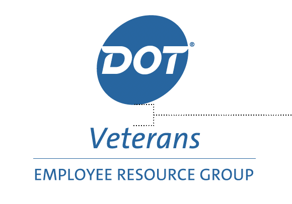
Be sure the relationship between the departments, services, or programs and the Dot logo is consistent, whether on promotional, print, or digital collateral. Please make sure the full title of the program is present. Vertical and horizontal versions are available.
Horizontal Stacked Title
For two-line horizontal title, the top line of type should align with the top of the Dot logo type.


Vertical Stacked Title
For vertical stacked titles, center the type below the logo.
The space from the Dot oval to the top of the capital letters in the text is equal to width of the letter “T” in the Dot logo.
Three-Line Names or Secondary Titles
For three-line names or secondary titles, set type so the middle line height lines up with the top of the Dot logo nametype.

Main Titles
For titles, set all type: 29 point type with 31 points of leading.
Types should be set in uppercase and lowercase using Dot TheSans Plain Italic. Please note, this font is only used for the logo. All other non-logo uses of san-serif fonts should use Open Sans.
Secondary Titles
Type for secondary titles should be set in all caps at 16 point type with 19 points of leading.
Types should be set in uppercase and lowercase using Dot TheSans Plain Italic. Please note, this font is only used for the logo. All other non-logo uses of san-serif fonts should use Open Sans.
To find authorized, original artwork or Dot sub-brand logos, contact Branding & Creative Services.
Limited Use Logo
In rare cases, only the logotype will fit or the outline.
In exceptional spaces—such as on event merchandise or the front of our trucks—the logotype alone may be necessary. In such cases, we use the Dot logotype by itself, without the oval.
